Visualisation
We now explore some examples of visualisations. Be aware there are so many possibilities out there for visualising your data. Think beyond the standard line or bar graphs!
Visualise your thesis
Visualise Your Thesis is an international competition run by the University of Melbourne that challenges Higher Degree by Research (HDR) students to summarise their research in an engaging, 60-second visual presentation using a supplied template, that encapsulates your research project. It gives you the opportunity to build essential digital communication skills so you can effectively communicate complex research to a general audience. Competition submissions are judged on their visual impact, and how well the content presents the research. The competition allows for multi-media, interactivity and interpretation and is suitable for all disciplines. The video here is from a 2019 winner, HDR student at UTS.
Timelapse
- You can highlight that time lapses would work well for event set ups, constructing buildings, or use of infrastructure throughout a day. This Pea Shoot video is very peaceful and therapeutic.
- Google Earth Timelapse Google Earth Timelapse is a global, zoomable video that lets you see how the Earth has changed.
Interactive graphs
There are many interesting interactive graphs available for you to ‘feel’. Some of our pick are listed below.
-
New York Times’ swing history graph really impressess audience.
-
ABC 2020 US election story covers complex stories with data very clear way.
-
This word cloud is developed with R Shiny.
-
Brisbane floods photo comparison presents how Brisbane was affected by 2011 floods by comparing photos. You can create this photo comparison by using a free tool introduced in HERE.
For R / Python users
If you are thinking of developing some visuals with R / Python, they will give you an idea together with coding :)
Inspired by examples
- Data vis Project gives you sooo many ideas about graph designs.
… and a little more
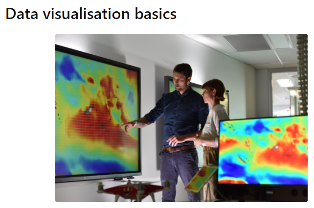
You can explore and learn coding-free publication quality visualiation tools from Data visualisation basics online tutorial.
If you want to create one by yourself, Northwestern University Knight Lab provides free tools for that under ‘Storytelling Tools’ section.
Make sure your point can be seen
There are a wide array of amazing and visually stunning visualisations to choose from. But ask yourself, does this visualisations clearly relay the message that I want my audience to take away, or do they get confused or take a different message away. If the audience cannot clearly understand the point you are trying to relay, then the visualisation has failed. The following visualisation display this point, the first is impossible to get meaning from, and the message is improved with each following one. They visualise the indexed cumulative GDP for each country between 1800-2020 (i.e. the sum gdp of each country standardised across all countries). Let’s attempt to demonstrate through the visualisations that wealth is very unevenly distributed across the globe. (The dataset used is from Gapminder data from R for Reproducible Scientific Analysis (https://swcarpentry.github.io/r-novice-gapminder/) , licensed under a Creative Commons Attribution 4.0 International licence, CC BY 4.0. (https://creativecommons.org/licenses/by/4.0/) by The Carpentries. It was downloaded from https://raw.githubusercontent.com/swcarpentry/r-novice-gapminder/ghpages/_episodes_rmd/data/gapminder_data.csv.)
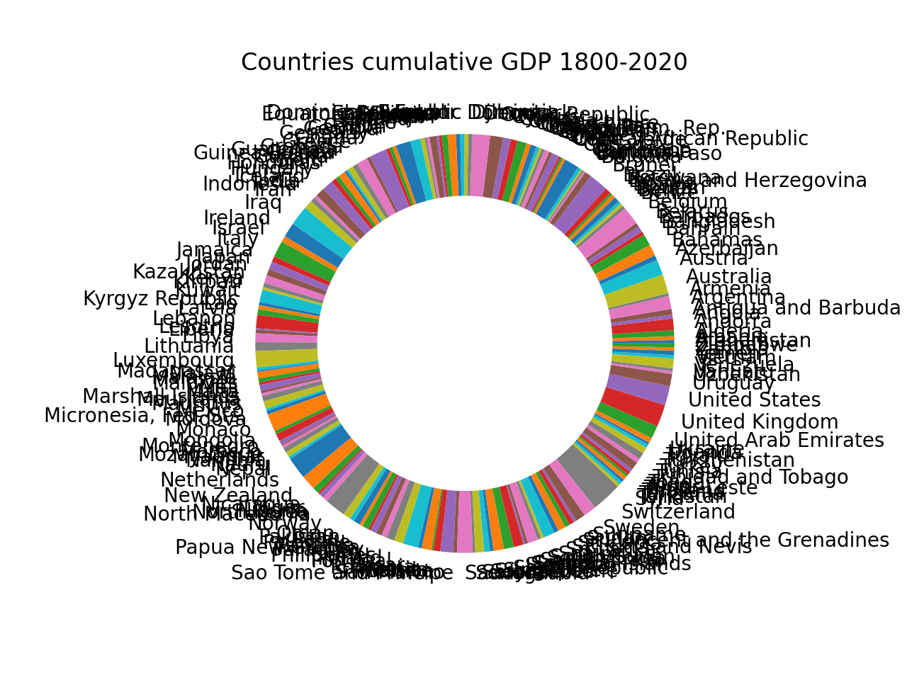
Pie and donut charts can be tricky to interpret, our minds have difficulty converting angles to units of measurement. A bar graph may be better as the units of measurement are stacked next to each other, making direct comparisons possible.
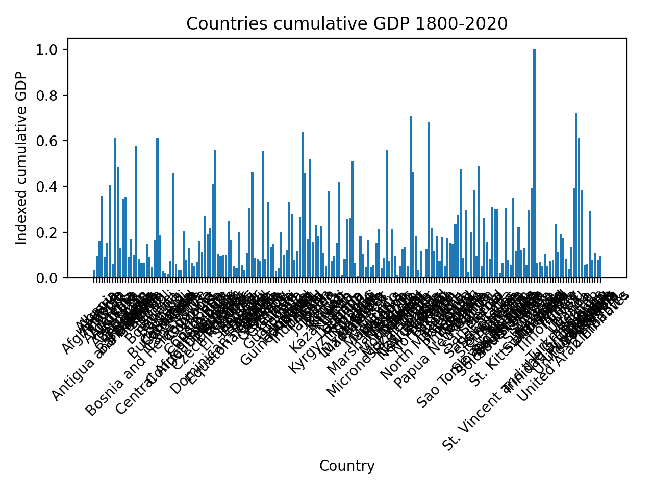
Now with the box plot we can directly compare between countries, there are far to many catagories (in this case the number of countries) which create clutter and our minds wander.
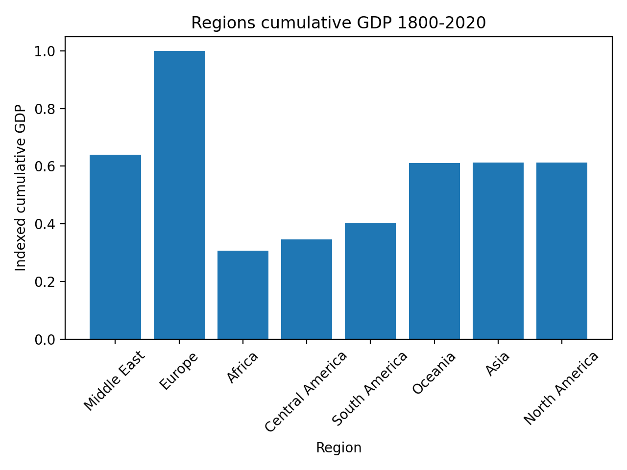
If we plot by region then suddenly we can very clearly see that Africa is the poorest region and Europe is the richest! But there is variation within regions. In Europe Switzerland is insanely rich, will Moldovia is definately not.
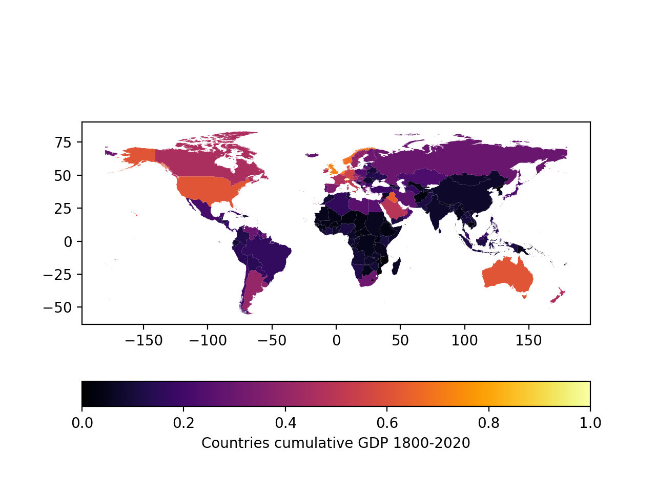
A heatmap displays this data the best, you can see the general regional trends, but within these regions there is also wealth inequality.
Simple techniques to make your point clear
There are a couple of simple techniques to make your point clearer. Here is a few:
- Headlines
- Callouts
- Highlight areas
What do they mean? Have a look at the video below!
Are you inspired by looking at examples of beautiful visuals? Next section is about a narrative, which is another vital part of storytelling.