Visualisation methods and tools
Visualising data can help us understand complex information quickly. Presenting your data in graphs, charts and images can help:
- reveal patterns and relationships
- identify trends
- communicate insights with impact
presenting your data visually can assist your audience to more easily understand your research and its applications, making it easier for others to conceptalise and synthesis the information.
Visualisation methods
The type of visualisations you can create are governed by the types of data you are working with.
The Data to Viz site provides an excellent overview of different visualisation types and will help you find the most appropriate graph for your data.
The visualisation types explained in Data to Viz are particularly useful to illustrate the analysis results of structured text, including metadata records and categorical data. Many of the graph types are also useful for visualising quantitative, statistical, temporal, or spatial analysis of “text as data”.
The Data to Viz team also provide a collection of useful tips and caveats for using visualisations.
A warning on using visualisation methods with text:
Visualisation methods and tools are useful for early data exploration and initial analysis. Always check results against traditional analysis methods which are more sensitive to language structures.
Quantitative analysis of textual data is a reductive process where the units of language are broken down. Take care not to make assumptions from visualisations that are not a real reflection of the data, its meaning and relationships. (Gabor, H. et. al., 2019)
Text visualisation examples
Below is a showcase of text analysis visualisations in recent peer reviewed articles.
In the image below, stylistic differences of the Brothers Grimm are visualised using the R package Stylo. This has clustered text into two groups of word choices, based on text extracted from letters written to friends and colleagues. It is a comparative representation of preferred and avoided words by brothers Jacob and Wilhelm Grimm. Overlapping markers show stylistic similarity, whilst the separated text clusters imply a consistency in word choices and an individual style. Read about the methods, models and analysis in detail at:
Gabriela Rotari, Melina Jander, Jan Rybicki, The Grimm Brothers: A stylometric network analysis, Digital Scholarship in the Humanities, Volume 36, Issue 1, April 2021, Pages 172–186, https://doi.org/10.1093/llc/fqz088.
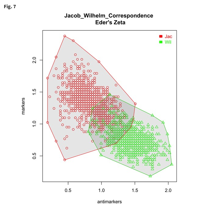
Image source: (Rotari et al., 2021) Reuse permission requested 24 August 2022 via RightsLink.
In this project, named entity recognition of occupations followed by frequency analysis of different professions featured in movies and televison shows was undertaken using data from the OpenSubtitles.org database. The line graphs below show frequency trends of certain professions depicted in movie and TV shows from 1950s to 2020s. Take a deeper dive into the methods and analysis, including sentiment analysis of the professions in media, in the full article:
Baruah, S., Somandepalli, K., & Narayanan, S. (2022). Representation of professions in entertainment media: Insights into frequency and sentiment trends through computational text analysis. PloS one, 17(5), e0267812. https://doi.org/10.1371/journal.pone.0267812
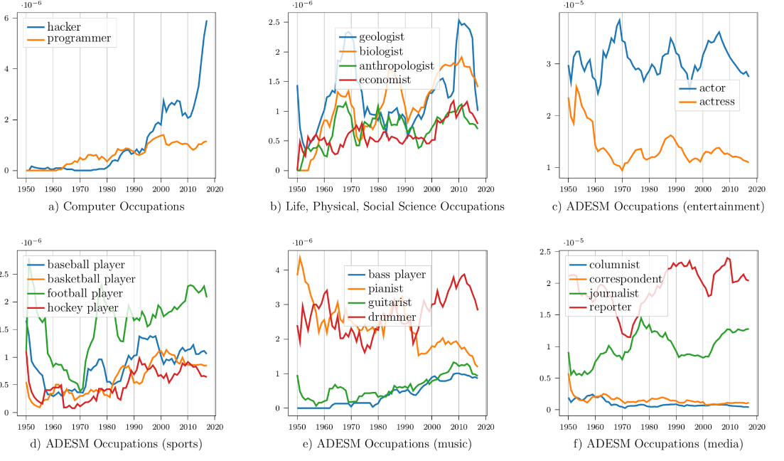
Image source: (Baruah, S. et al., 2022) Licenced under Creative Commons CC-BY 4.0.
In this study Voyant tools and NodeXL software were used to mine, extract and collocate words. This enabled qualitative coding of seven major themes from over 1000 individual public submissions to a 2018 Queensland Parliamentary Inquiry on voluntary assisted dying.
Explore the analysis and methods further in the article:
Kirchhoffer, D. G., & Lui, C. W. (2021). Public reasoning about voluntary assisted dying: An analysis of submissions to the Queensland Parliament, Australia. Bioethics, 35(1), 105-116. https://doi.org/10.1111/bioe.12777
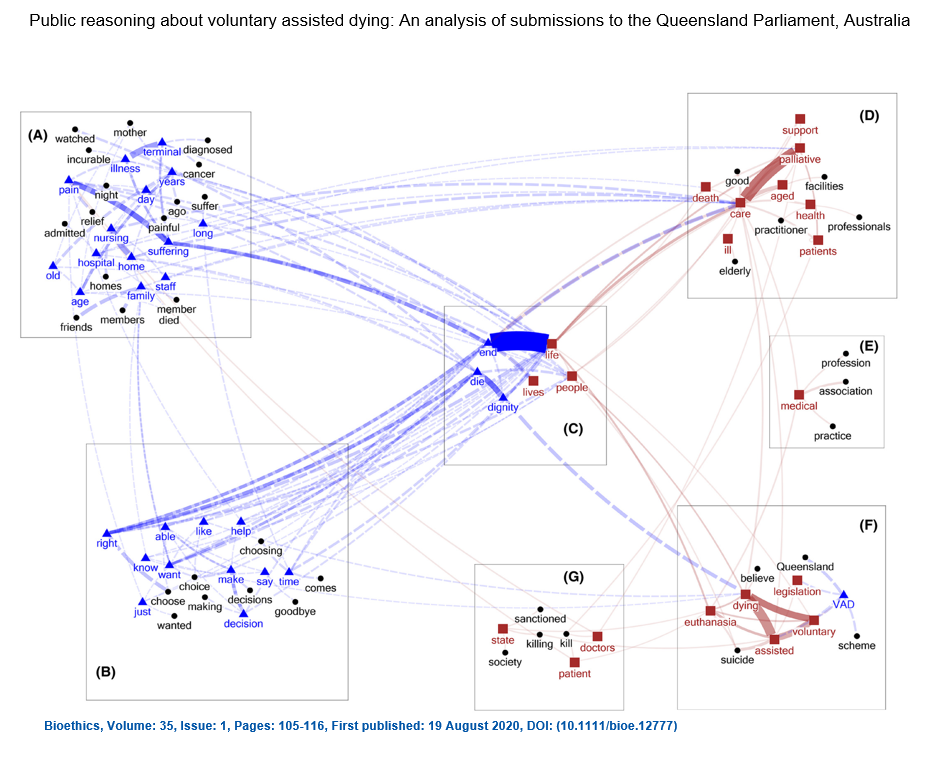
Image source: (Kirchhoffer & Lu, 2021)Licenced under Creative Commons CC-BY 4.0.
In this bibliometric analysis, Griffith Researchers identified five major themes in climate change adaptation literature based on the 100 most commonly used keywords. Publication results from literature databases were imported to VosViewer to create this network diagram. The size of each circle is proportional to the occurrence of the keyword, while links represent keywords used together in at least three publications with the line thickness proportional to the strength of co-occurrence.
Read more about the findings and methods at: Nalau, J., & Verrall, B. (2021). Mapping the evolution and current trends in climate change adaptation science. Climate Risk Management, 32, 100290. https://doi.org/10.1016/j.crm.2021.100290
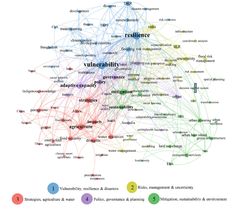
Image source: (Nalau & Verrall, 2021) Licenced under Creative Commons (CC BY-NC-ND 4.0)
Librarians at Yale University undertook computational analysis across the entire collection of long-running American fashion magazine Vogue. This cluster dendogram identifies fabrics that are mentioned in Vogue over 122 years and groups them together using the machine learning method of word embedding.
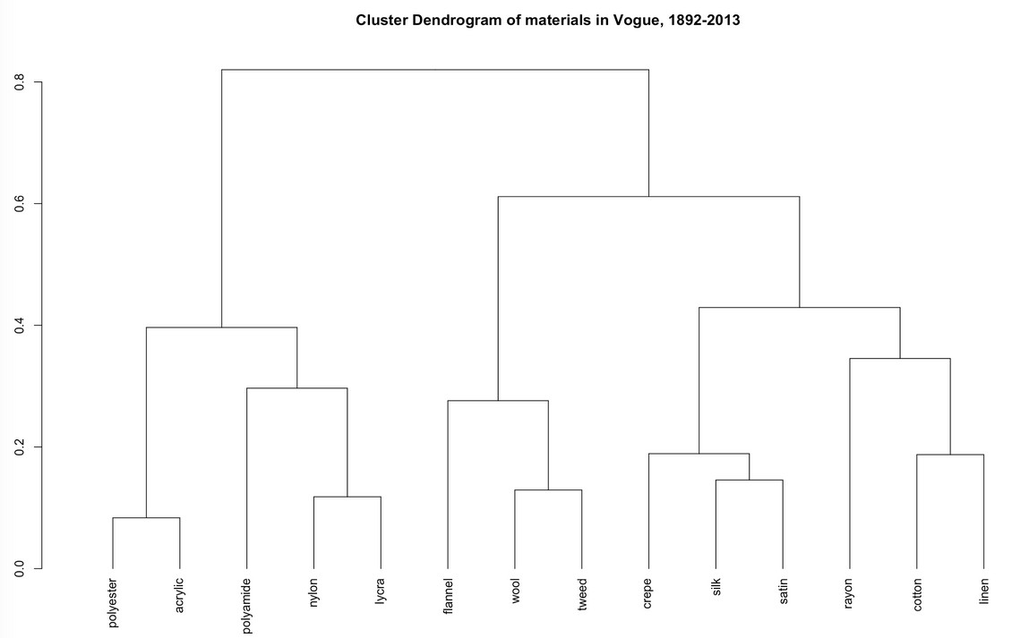
Image source: http://dh.library.yale.edu/projects/vogue/fabricspace/
Explore how these fabrics are related to each other at the project’s webpage.
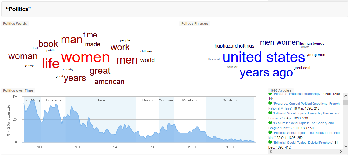
Image source: http://dh.library.yale.edu/projects/vogue/topics/
The topic Politics visualised above was generated by statistical methods using the Mallet computer program after mining all articles published in Vogue. It groups together those words which co-occurred more frequently. The timeline displayed shows the frequency of that topic in articles across years.
View the other topics identified in Vogue and their frequency across time.
Explore the many computational methods and visualisations available from the Robots Reading Vogue project:
Leonard, P. and King, L., (n.d.). Robots Reading Vogue.(accessed August, 19, 2022). http://dh.library.yale.edu/projects/vogue/
This research undertook quantitative text analysis of the corpus of U.S. Circuit Court decisions from 1975 to 2013, focusing on a set of judges later nominated for, or promoted to the U.S. Supreme court. Sentiment analysis was one of the methods used to explore Judges’ written opinions and identified differences in sentiment towards particular groups. The coefficient plot below, produced from case-level regressions, illustrates language sentiment towards farmers by individual judges, with positive sentiment indicated above zero and negative sentiment below zero.
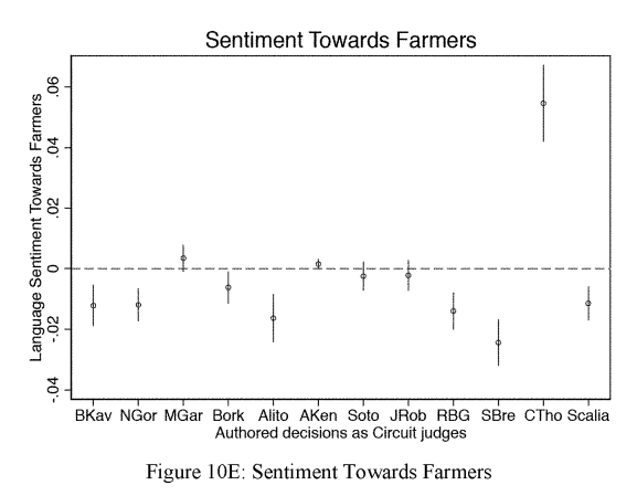
Imgage source: (Ash & Chen, 2018) Reuse permission requested 24 August 2022 via RightsLink.
Explore the research further:
Ash, E., & Chen, D. L. (2018). What Kind of Judge Is Brett Kavanaugh. Cardozo Law Review De-Novo, 2018, 70-100. Available at SSRN: https://ssrn.com/abstract=3307754
Researchers mined keywords from online news articles across 2011, from 13 country-based Non Government Orgaisations (NGOs) that focus on issues related to aging. The alluvial diagram below was created using Pallozio script which is available via open source visualisation tool Rawgraphs.io. The diagram shows a bipartite network with ageing issues identified and distributed by country. The width of the streams indicates frequency of mentions of the issue. Issues are indicated on left side of the diagram and NGO’s countries that mention the issues are listed on the right. It is easy to see common issues and the dominance of issues within particular countries.
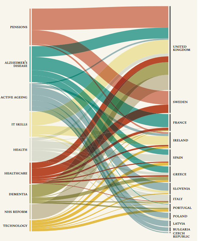
Image source: (Rogers, et al., 2015) licenced under Creative Commons CC-BY-NC 3.0
The full report utilises bubble, network, heat list and word frequency cloud visualisations to explore the data, read more at:
Rogers, R., Sánchez-Querubín, N., & Kil, A. (2015). Issue mapping for an ageing Europe. Amsterdam University Press. https://library.oapen.org/handle/20.500.12657/33128
Further to these are articles which highlight visualisation examples in specific disciplines including:
Music research: Khulusi, R., Kusnick, J., Meinecke, C., Gillmann, C., Focht, J., & Jänicke, S. (2020, September). A survey on visualizations for musical data. In Computer Graphics Forum (Vol. 39, No. 6, pp. 82-110). https://doi.org/10.1111/cgf.13905
Visualisation tools
Most of the text analysis tools listed on the previous page also create visualisations of the data.
In addition to the analysis tools, the following can be used to create visualisations:
- MS Excel for structured, categorical text data
- RawGraphs : open source program (free) for structured, categorical text data. Developed at the Density Design Research Lab.
- computational code including R & Python.
- TRAViz : generates visualizations for Text Variant Graphs to show the variations between different editions of texts.
- TagPies Online : visualise comparisons of classical terminology in texts.
Create a publication quality image of your visualisation
Once you have visualised your text analysis results, they will need to be formatted for publication submission.
Explore the simplest tools and methods to convert visualisations into publication quality images.